cuNext
What & Why
cuNext was a project done at UOttaHack6, our team set out to update Carleton’s outdated and inaccessible UI. We also implemented a course scheduler that used backtracking algorithms to ensure that no course conflicts would occur.
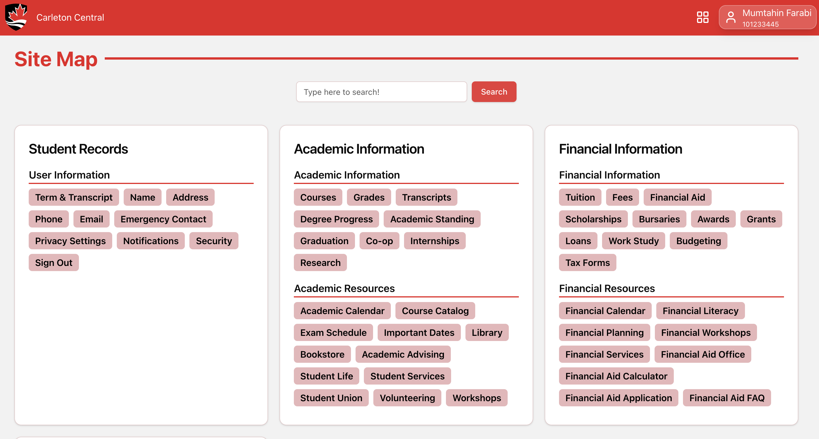
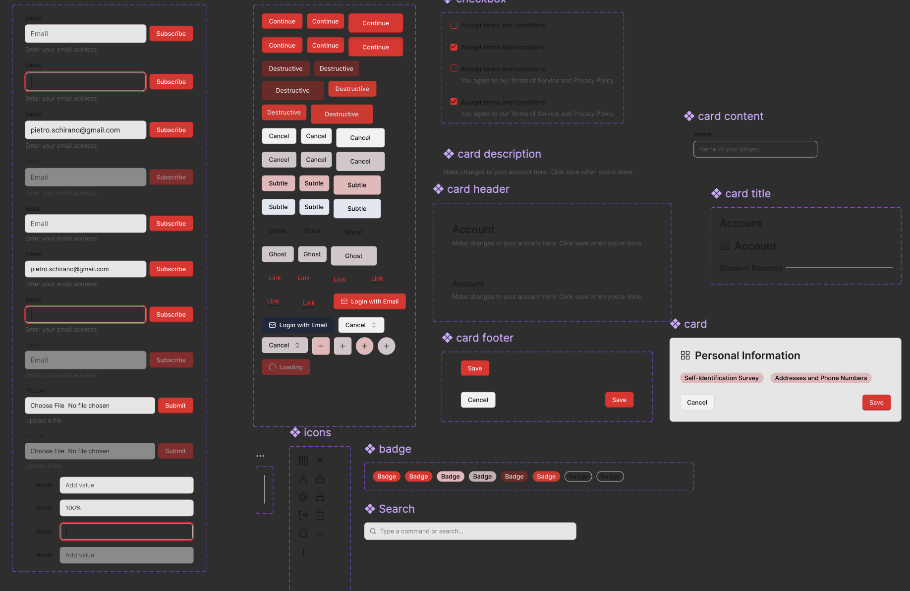
Design System at Work
See the entirety of our design system at work here.
Integrating Shadcn with Figma
In cuNext, our goal was to create a seamless connection between our design work in Figma and the implementation layer using shadcn/ui. We started by building out our design system in Figma, focusing on reusable components, consistent spacing, and strong accessibility foundations. Figma served as our single source of truth for the visual language, including color palettes, typography, spacing, and component states.
To bridge the gap between design and code, we leveraged shadcn/ui—a modern React UI kit built on top of Radix primitives and styled with Tailwind CSS. Our workflow typically involved:
- Component Mapping: For each Figma component (like buttons, cards, inputs, switches), we identified or customized an equivalent shadcn/ui component. We referenced Figma’s naming and structure, keeping variants and states in sync.
- Design Tokens: We mirrored Figma color tokens and spacing variables in our Tailwind config. Our
tailwind.config.jsandapp.cssfiles define custom CSS variables (e.g.,--primary,--border,--radius) that match the Figma palette, ensuring visual fidelity between the two environments. - Iterative Feedback: As we implemented components, we regularly checked them against Figma prototypes, making tweaks in both code and design to address inconsistencies or accessibility issues. This iterative loop was key to maintaining parity.
Using Design Systems: Feedback, Refinement, and Best Practices
A robust design system was at the heart of our process. We established a library of Figma components—buttons, badges, cards, navigation bars, dropdowns, and more—using Figma’s autolayout and component variants for rapid iteration and scalability. Every component was built with accessibility in mind: proper contrast ratios, keyboard navigation, and clear focus states.
Throughout the hackathon, we sought feedback from teammates and early users. We ran informal user interviews to identify pain points, accessibility gaps, and usability issues. Based on this input, we refined our components, adjusted spacing, improved color contrast, and ensured every state (hover, focus, disabled, etc.) was covered in both Figma and code.
By tightly coupling Figma best practices (like autolayout for responsiveness, consistent use of styles, and extensive use of variants) with shadcn/ui’s composability and Tailwind’s utility classes, we ensured that our final product was not only visually consistent but also maintainable and scalable for future work. This tight integration allowed for fast prototyping, quick iteration, and a smooth handoff from design to development.